Mastering Flutter's Text Field: A Common Class for Flutter Material Text Field
Flutter text field is an essential widget that allows users to enter text in a mobile app.
In this blog post, you'll learn everything you need to know about Flutter text fields, from creating a basic text field to implementing advanced features such as input validation and formatting.
Usage:
CommonTextField widget is a custom text input field in Flutter that provides additional features and customizations beyond the standard TextField widget.
It has properties for setting text input type, hint text, error text, prefix icon, text color, background color, and border radius, among others. It also has validation capabilities that can be used to check user input and provide confirmation or error messages.
Code:
..
Properties:
| Property | Description |
|---|---|
| controller (required) | The TextEditingController that controls the text field's content. |
| hintText | The hint text that appears when the text field is empty. |
| keyboardType | The type of keyboard to display for input. |
| obscureText | Whether the text should be obscured, e.g., for password fields. |
| onChanged | A callback function that is called when the text in the field changes. |
| helperText | Additional helper text that appears below the text field. |
| labelText | The label text that appears above the text field. |
| maxLines | The maximum number of lines the text field can expand to. |
| hasError | A boolean value indicating whether the field should display an error style. |
| prefixIconData | An icon that appears before the text field. |
| passwordHideIcon | The icon to display when the password is obscured and can be used to toggle the visibility of the password. |
| passwordShowIcon | The icon to display when the password is visible and can be used to toggle the visibility of the password. |
| textInputAction | The action to take when the user submits the text input. |
| textColor | The color of the text in the text field. |
| accentColor | The accent color used for the label text, prefix icon, and other accent elements. |
..
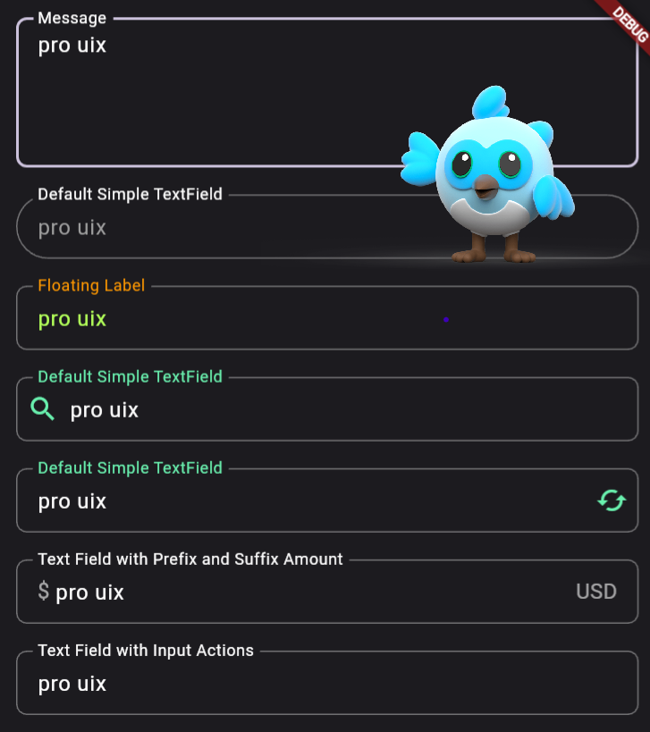
Output:
..


Post a Comment